Viviscal Web Refresh
Viviscal's website contained years of accumulated messaging and outdated graphics, which made it difficult for shoppers to find information and build confidence. So we jazzed her up a bit.
Channels: DTC
My Role: Audit the customer journey, simplify the experience, redesign content flow, and rewrite key pages to make the site more educational, approachable, and conversion-focused.
Before: Proven Results Page
Buries scientific credibility beneath dense, repetitive copy. Feels overly salesy, visually clunky.

Before: About Page
Relies heavily on brand history and doesn’t provide product-specific information. Flow of content feels unstructured and overwhelming.

After: Proven Results Page
I provided an entirely new content strategy, suggesting new modules to better highlight persuasive statistics and selling points. Then, I wrote new copy that was engaging and easier to scan.



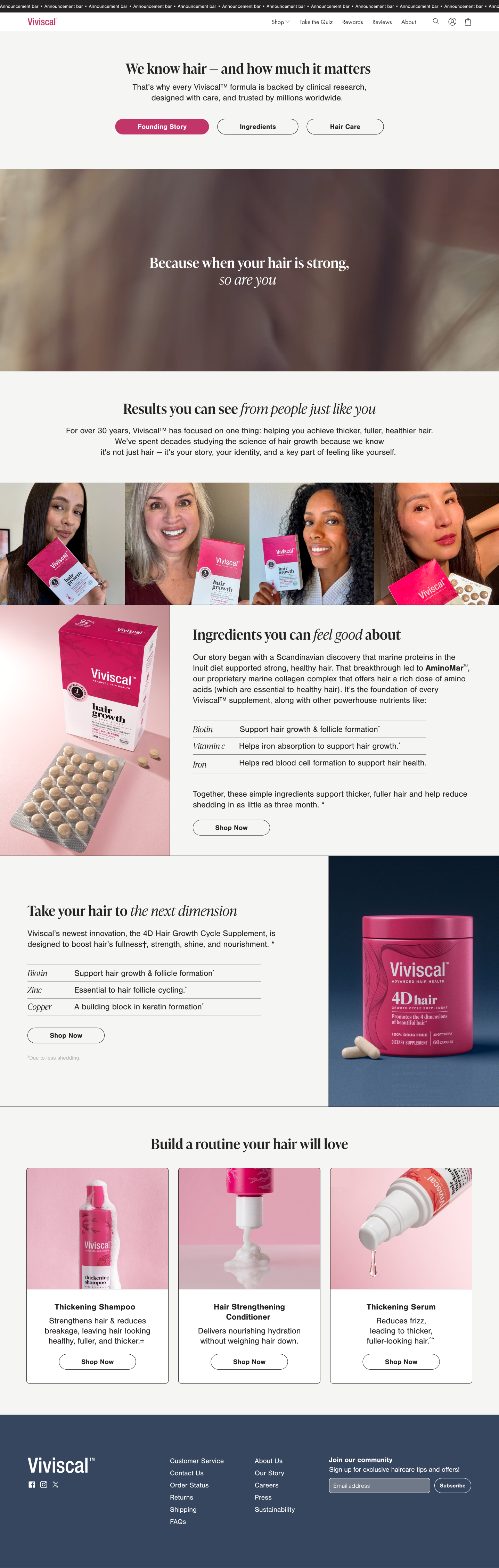
After: About Page
Reorganized the page to empathize with shoppers first—> introduce digestible product information—> highlight the latest innovation—> reinforcing a routine. And that’s on the marketing funnel.